Graduates, here’s how to get noticed and land that dream product design job
Posted by Ben Mazur 22.11.2019
 Make your design portfolio stand out
- Make it personal
- Make it relevant
- Keep it short
- Make it mobile friendly
- Focus on your strengths

Ben Mazur
Managing Director
Your portfolio is your secret weapon
Consultancy is a very rewarding career, it’s fast paced, full of challenges and you’ll learn a lot very quickly. But it is also very competitive and your CV is often in a pile with many others. How do your two black and white pages stand you apart from anybody else? We receive hundreds of CVs and portfolios per year. How are you going to get noticed in all of that noise? You only have a few hundred words in your CV to sell you and your skills, which is not a lot. So your portfolio has to do the talking, it’s your pitch and it’s your opportunity to show what you are about.
As a young designer or engineer, your portfolio is the most important document in your professional career. It says far more about you than your CV and has the potential to stop a hiring manager in their tracks with a piece of hard physical evidence of your talent. But how do you create the kind of portfolio which lands in a hiring mangers inbox and stops them in their tracks? Read on for our tips on how to get noticed.
1. Grab attention with your opening email
We could have had 15 other applicants today, why would we look at yours, you’ve got a very small window to grab our attention. Here’s our tips:
- Keep it short and personal
- Be clear what you are asking for and why you want it
- Don’t brag or flatter
- Say who you are and what you care about
- Tell us your main skill
- Tell us something you are proud of
- Tell us why you’d be a good fit
2. Make it relevant
Make it about you AND us. Relevant is guaranteed to get you noticed. So many CVs and portfolios say I want to learn this, or I want to do that. Everyone’s has personal ambitions and that is great, but it is a little uninspiring. Instead say this is what I am good at, this is how I think and this is why I will fit well in your team. You want the hiring manager to see your portfolio and think wow, this person thinks just like us, I need this person on my team. That’s hard as a graduate, but to do that you have to be relevant. It requires a very delicate balance of and modesty and self-promotion.
If you’re just starting out you might not have that much to show, your university projects or recent work might not be relevant. But leave out the A level projects and toaster sketches from your first year. Challenge yourself to design something relevant. Do your homework. Look at what we do. What can you bring? Design something that might interest us. Show us what you can come up with.
3. Keep it simple
Too little is better than too much, we commonly receive portfolios of 30-50 pages. Pages with lots of text and lots of images. You’ve got a very short window and we don’t want to scroll through pages of sketches of kettles copied out of textbooks. Show us your major projects and anything relevant you’ve done since. Show us you. That’s it.
- A single image, chart or table per page is usually enough
- Use just enough text to get the message across
- Put your CV on the last page of your portfolio
4. Make it mobile friendly
Don’t assume people will be viewing your portfolio on a computer. Keep it small and easy to open on mobile. Consider that the person looking at your portfolio may want to share your work with a colleague from a mobile device requiring other apps in the process.
Our advice:
- Don’t zip lots of files, zips are difficult on mobile.
- Keep it small, make it fit in an email, keep it under 10mb.
- Don’t use file transfer services, Dropbox or Google Drive
- Tradition is for portfolios to be landscape, but the chances are it will be viewed on a phone so forget what you’ve been told, send us a portrait portfolio.
- Don’t use Wix to build a personal website, it doesn’t work well on mobile.
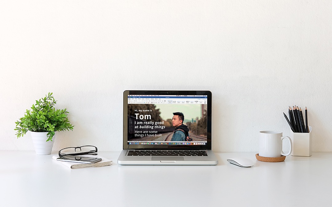
- Don’t send Microsoft word files, they won’t render well on a phone.
- Don’t do anything which requires more than 1 tap to see your work
5. Show us your strengths and passions
If it’s not your best work, leave it out. Seriously, less is more. You’re better off saying here is something I have designed or made that I thought might interest you, it’s in an area you work in, I learned X by doing it. That is much more interesting than sending pages of unrelated things you’ve drawn since high school.
We care about how you think, not how fancy your sketches or renders are, so if you’ve got big ideas or ambitions then explain them but be clear and succinct. We appreciate good renders and beautiful sketches, but those are just tools in the designer’s toolkit. What is special about your brain? What is special about you and how you think? Our job is about solving problems not illustrating solutions.
Get noticed
Be concise, relevant and humble and lead with your strength and passion. If you do all of these things you will be in the 1% of the most interesting applications we receive. So go ahead, we challenge you, design something that stops us in our tracks and send it to us through our careers page.


